- When we were preparing our pitch we made sure that we conducted our audience research this meant that at every step of development we were able to make informed decisions over any of our decisions.
- The first rough cut that we did was quite early on as we had shot early and already had a lot of our narrative shots that could be put into our video, this was our animatic / first cut as we had thought that it was best to put both in one and then got some research from this. Feedback on this was generally positive and gave us a chance to get more ideas from what we can do in our performance shots. It was very useful as it meant that we could see that our music video even in its early stages was meeting its target audience.
- Before our completely final cut we made sure to test it to an audience as it was hard to objectively think about the risks we had taken in editing and shooting and many of these worked however many of the drama studio shots of the narrative did not work so we had to take these out. We wouldn't have thought about doing this without our audience research and our audience also gave us a few ideas of what to do and a couple of areas that needed to be tweaked (for example to dissolves had to be smoothed and lengthened in some areas).
The target audience for our track 'William Powers' by The Maccabees would be indie or rock fans and probably more likely to be in there teens. This is because The Maccabees are a youthful band which inturn means the fans are more likely to be younger.
For our methodology we decided to use a few ways to gather our results. We used a survey earlier in the production for feedback of our concept and rough cut and a focus group for our final cut. For the survey we asked friends and family as we thought this would be the best way to do it. This was because we could gather results quicker than if we used survey monkey and had to post it on internet sites for results.
I gathered a few people for a focus group for our final cut. This helped us with feedback as I could talk to them individualy without any hassle and ask them for their opinions.
It was important to test our concept in pre-production to an audience because we needed to find out the possibility of this music video being made successfully and that there would be a target audience for it. The results showed that our basic idea of the narrative and the performance was good, however we needed far more research into it rather thatn having small amounts of evidence to try and back up what we were trying to accomplish would work.
We tested a rough cut of the video and the feedback was average to say the least. What we needed to do was rather than have long shots with a fair amount of gaps in, we had to increase the cutting rate and remove the gaps with filler shots.
Finally we carried out a focus group to gather results for our video. I carried out two, one with my family and another with a small group of my friends. After watching the video the feedback was very positive. Bits we had to improve on, or could have improved on were the syncing of the drummer, which was off in quite a few shots unfortunately and possibly trying to make the narrative slightly clearer for the audience to understand.
We have also recieved comments from fellow students, here are two of them:
Cally12
'The band performance (apart from the drummer) was really convincing - they looked like they were genuinely playing this. I loved the shots of the band on the sand dunes, mixed in with the other band shots. Nicely done. Along with the beach-based couple's narrative. The only bits I wasn't sure about were the floating spotlit heads on the black background. Not sure how effective they were. The rest of it was great though, and nicely edited together.'
Sam
'I really like the song and the main singer (ol' buncey) is really convincing and suits the song, although the 'I must brave' lyric is slightly out of sync, otherwise the fading works well. Nice one!'
The digipack feedback so far been positive. When creating it I was concerned that black and white may not look that good on the covers but it turns out it has looked really good and many people actually prefer the black and white colour.
When I asked people what they thought of the digipack, one person said 'I like the effect on the band but I dont really like the whole album case being black and white'. This was one of my fears as I thought it may have been too boring but when i asked around some more the feedback was more positive about the black and white concept.
Below is a presentation using Prezi to show some of our results from the audience feedback.
-The use of we media aided a lot in the production of our music video, the biggest area where it helped was when we were coming up with the shots that we wanted to recreate. For example I spent a lot of time on youtube which is where I found most of my ideas for the shots that we took.
-The blog allowed us to work collaboratively with ease as we could post our ideas on there are we could comment and brain storm ideas together without having to meet up. However, I personally found it difficult to post my ideas up there as I find it much easier to verbally communicate my ideas and have a discussion face to face to evolve my ideas and incorporate others into them.
-The animatic we created was useful as we had already shot some of our footage before we had finished our animatic which meant that we could see what we needed to shoot and if some of our shots would work or if they needed to be changed to fit with the clips we already had.
-In order to create my print text i used photoshop elements as it easily allowed for the manipulation of my images. I used the stamp tool in order to get the effect that I wanted on the images as I wanted them to be black and white but just desaturating the images wasnt quite enough and this gave me that added extra level of intrigue in the overall advert.
-For the editing of the video we used premiere elemtents 8 this allowed us to edit in HD. The three main effects i used in the video where the filters i made to go over the different pieces of the video, the dissolves linking the overlayed footage to the performance, and some of the clips have been flipped. the filters that I used were presets that i set up using the RGB and opacity this allowed me to simply drag and drop the filters onto the appropriate parts of the video, making for easy editing.
-The use of HD cameras in the shooting of this video allowed us to capture the shots into the PC much quicker then with the DV cameras. The one issue that arose was a human error that occured while shooting the drama studio shots with the band as Owen shot everything between the shots he was suppose to do. So when he wanted to record he stopped recording and vica versa. However this was not too much of an issue as I had already shots some of the performance in the drama studio so these are the ones that feature in our video.
-I was very comfortable with the editing as this is definitely one of my strengths when it comes to media as I am able to figure out how to do things quite easily and anything I needed help with our technician was always on hand to help. The only issue that arose was the software would not allow us to was the footage back without before rendering which did add a lot of time to the editing process, but this was not a major issue.
-I used a number of different forms of IT to communicate as I used the blog to communicate ideas to Owen as this allowed us to put ideas up where they are easily accesible and are automatically saved. Furthermore I have used PowerPoint to communicate in the pitch that we prepared at the begninning of the project, this was useful as it allows for easily presentable presentations.
-The text that I have created was made to run in NME as a full page advert, this is because NME already has a clear target audience that would be interested in the maccabees. I tried to draw the attention of the reader through the use of black and white colours accept the one area that the eye is drawn to first that is the banner that says OUT NOW in red.
- Our two print texts are very obviously visually linked through the use of black and white and the images that we use. Furthermore the text that we use in our background and titles we have kept the same this is enhancing the overall band image and this creates a conherent and obvious link.
-Dyers interpretation of this text would see that the construction of all three of these texts leads to an overall band image. The band is portrayed as present through the way the 4th wall is broken, however the band is absent as shown through the way the performance isnt always given straight to the camera.
-our video has an indie stylistic feel. I took a lot of inspiration from “for the first time” by the script, the shots of the band performing in the drama studio were based loosely on the shots I watched in that video. We tried to keep to conventions which i believe we have achieved as our narrative and performance enforce conventions and the filter i made to go over the top made the video feel much more indie and british as the dark de-saturated colour is often seen in indie videos.
-The camera work that we used gave us a variety of shots some of these worked better then others. with the shots that we did in the drama studio with the performance we used a dolly and close ups, these worked very well as they follow conventions. however, the shots of the narrative done in the drama studio did not work quite as well as they did not fit with the overall feel of the video but the shots on their own were not bad. we tried to come up with our own ideas as well as taking from videos that we have watched, many of the shots at camber were shots that we had come up with, but the drama studio was mostly taken from conventions we had spotted in other videos. -When editing for meaning we used filters to clearly show the difference in location and who was in the shots. for example the shots at camber with the actors we used a yellowish sepia filter with gave a contrast that was not drastic. the simple low fi effects that we have used are in keeping with indie music and british music. - Our use of mise-en-scene has allowed us to convey meaning through the use of location as we have shot our performance in a drama studio showing that they are a band and obviously they are performing the song, this also adds to their star image, the narrative is shot in camber sands and the filter we have put over the top shows that there is a clear difference between the two locations adding to the meaning of the video.
- Our video can be seen as Postmodern through the way we tell our Asynchronous narrative while we overlay this with the performance and draw a link between these two locations by having the performance shot in both locations. Through this we have also helped to construct the star image as you could read this text as when the band are performing in camber they are seen as present and ordinary they when we cut to the shots in the studio they would be seen as absent and extraordinary.
1. In what ways does your media product use, develop or challenge forms and conventions of real media products?
Our music video (William Powers by The Maccabees) uses and develops conventions of real media products by using similar techniques and thought processes to create a unique video that stands up to repeatability.
As you can see above and below we follow the video with two main parts; the band and the couple of the narrative.
There is a clear distinction between the narrative and the band shots with different filters layered over each one to create them more unique and to stand out. This conforms to other media products conventions as with performance and narrative based videos they want the audience to notice the difference and therefore enhancing Dyers two key paradoxes. I will come onto this in more detail later on.
In our video we use a fast cutting rate which is very conventional to normal music videos. A bit we struggle on at first was the lip syncing and the cutting rate of shots in time with the music. Eventually, with the help of the drama studio shots, we overcame this. Here is an example of some of the lip syncing in the video.
This shot above of Ryan singing 'There are storms' is perfectly in time with the music and lyrics and to help enhance this we cut the shot just before in time with the music to see Ryan sing those lyrics. Although this is an 'indie' genre of music we actually conform to the pop conventions of a music video where we have a performance and a narrative with lip syncing and close ups of the band and couple.
With the shots we have taken we have tried to create a simplistic video however when it came to editing we were far from simplistic as we used many effects to create a unique video. For example on the shot above alone we have created a pre-set filter which has upped the sepia in the video to make the beach shots with the couple in look dreamy and out of this world.
This is a close up of the lead guitarist and his guitar. This conforms to conventions as it is showing the guitar in time with the actual music and this is normal in most videos.
Furthermore what I think turns this video from a simplistic one to one of more complexity is the fact we have the narrative that is slightly unclear and is there for the audience to interpret in their own way. Add this too the band shots and the occasional shots that involve both of them create a slightly more complex video that people can interpret in their own way.
Above shows most of the band in the drama studio. For these shots, we tried to stick with the indie type of mise-en-scene with a polo top for the lead singer, a cardigan for the drummer and a rock T-shirt for the bassist. This makes the band image look normal and more ordinary which is what we wanted. It makes the audience feel like they can be part of a band because of the simplistic clothing of these band members.
For the mise-en-scene with the narrative shots of the couple, we again went for an ordinary selection of clothes with the male only wearing a polo top and jeans with the girl wearing a top and skirt with a cardigan.
This is an example of a close up of the female in our video, overlooking the beach and sea of Camber Sands. This conforms to conventions however it is evident in most videos that close ups are used.
This is the close up of the couple, showing emotions between the two and furthering the narrative between these two characters.
Dyer
When applying Dyer's critical framework to this video we can see that the bands star image is created through the performance in the drama studio. It makes them look ordinary as it gives the audience the impression that they are just 'rocking out' as a band by themselves. This is contrasted with the fact they perform on the dunes of Camber Sands which makes them look extraordinary as no one would normally do this. Also, with the characters looking ordinary it makes the video more accessible for the audience as they can relate to the characters.
With the 'dreamy' feel of this music video with the dissolves and different saturation levels in the narrative and band shots it makes the bands star image mysterious yet not intimidating. After consuming this video you are left wanting more and this conforms to Dyers work.
This is the lead guitarist on the dunes by himself with the wind blowing in his face. This creates a star image for him as someone who is cool and furthermore this makes the video look post modern.
Another aspect of our video that makes it post modern would be the dissolve effect, which is used heavily throughout, as you can see above. This creates a video that looks different to most but it keeps in line with the storyline without really challenging any conventions. It looks normal in our video as the video is always switching from the narrative and performance; it looks natural for them to link towards the end.
This is one of the final shots we see, right at the end of the video. We dissolved the band shot of them in the drama studio in to the Camber Sands shot with the male walking away from the female, and copied the effect twice.
We also look at Goodwins theory of there being a link between the lyrics of the song and the video. For example, the lyrics ' There are storms' show visual links as we have the lead singer walking along the edge of the sea with the wind in his face, possibly connoting the 'storm'.
2. How effective is the combination of your main product and ancillary texts?
This is our final digipack for The Maccabees album 'Wall of Arms'. The style of the album is slightly different to that of the main product in such that it contrasts each other. This is because the digipack is all black or white with no colour what so ever whereas the music video uses a wide range of colour between the shots in the drama studio and the shots in Camber Sands.
The effectiveness generated from these contrasting products are that it doesn't necessarily conform to conventions. The digipack looks and feels different from the main product, which is exactly what I wanted to do; create something so different to the video so it stands out as its own product. Furthermore there are some links to the main text through the bands togetherness. What I mean by this is they perform together on Camber Sands and in the drama studio and are all together on the front cover. They are a band but it also looks like the relationship between the band shows another link to the narrative of caring for each other.
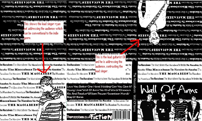
This is the front cover of the digipack. I used photoshop heavily here to create this final cover. What I believe is effective in this cover is that all the band look present to the audience, apart from the lead singer Ryan. He is looking away, almost as if he didn't care about the photo being taken. Furthermore you could interpret it as him posing for the camera but whichever way you look at it I believe it creates a band image of 'cool' and 'stylistic'.
The positioning of the guitarist as well; with his head just over laying 'Of' in the cover makes us feel slightly different about it. In a way it shows the band members to all be unique in a way with Ryan looking away, Oli standing up straight with his arms crossed, the bassist on the left with his arms by his side and finally the drummer with his arms across his stomach.
This is one of the inside covers for the digipack and again I have used the filters on photoshop to create this. It is just a simple stamp however it contrasts the main product with Ryan in black and white, almost like a cartoon, leaning on the microphone stand. If you look closer, he is positioned to the right of the background, meaning you can see The Maccabees text running along underneath Ryan.
This is the other side of the digipack. What we have done is taken the two main band members in our video, (Ryan the singer and Oli the lead guitarist) and used the stamp effect to make them look different for the digipack. This however is a key link to the main product as it shows the two main members of the band in the video and on the digipack. This makes them look extraordinary compared to the other band members but it also makes them look unique, such as Oli playing the guitar solo on the dunes of Camber Sands.
We also have a link between the digipack and Nathans advert, this being the text running behind the digipack of 'The Maccabees'. This effect makes the digipack and advert stand out compared to other products as wherever you look you will always see the band name, which I believe is important as it makes people stop and look at the products.
The Iconic and Linguistic Signs
On the front cover we have the band addressing the audience with first person mode of address, apart from Ryan who looks away. The leading line on this front cover of the digipack would be starting right in the middle and from there you would go down looking through the band members and then you would follow up to the top of the digipack cover where all the text is.
From this cover you could interpret one of the iconic signs to be the band as a whole. We are shown the band all next too each other. The linguistic signs would be the album name and the bands name written in different styles of text all over each cover.
This is the back cover and you can see the linguistic signs of the song names and again the name of the band, there record label and their website name. I kept the back cover and titles of track names in black and white to keep continuity throughout the album however at one point I thought the use of colour for the album track names may be more effective.
There are links between the ancillary texts and the music video. For example the black and white colour choice links in with the desaturated band shots in the video. However the audience may not pick up on this so we have a picture of the band on the front cover to link with them performing in the drama studio and Camber Sands.
This is the old digipack and we felt it didnt link to the main product of the video. It didnt have the 'indie' feel we wanted and as it was in colour it didnt link with the desaturated band shots in the video.
4. How did you use media technologies in the construction and research, planning and evaluation stages?
In the construction phase, we were lucky enough to be able to use High Definition cameras for the first time this year. This proved extremely useful as the quality was just incredible compared to last years work with the older cameras.
The camera above is very similar to the actual cameras we used. The quality of picture and sound were far superior to the old cameras and with the help of this new technology we were able to create something which not only looks good but sounds good also.
Obviously the cameras played a significant part in the capturing of our music video however without Adobe Premiere 8 we would have no edited footage. This programme, although slow at first, was the reason why we produced such a good standard of work.
The usefulness of Premiere 8 helped us not only create a pre-set filter that Nathan made but also allowed us to drop dissolves and fades wherever we wanted. For the animatic, it was also useful as it allowed us to put in snapshots of our storyboarding as well as actual footage so we could get an idea of what stage we were at. That was the other useful ability of Premiere 8. It enabled us to drop a screenshot where we wanted so we could create an animatic.
The snap shot above is that of Camber Sands, with the filter over it. As you can see the filter was useful as it created that sepia feel we were looking for.
This is the other pre-set filter that was created with the help of Premiere 8. This filter was for all the band shots and we made it slightly darker, with a little bit more red, to contrast the Camber shots but also to cover up parts we didn't want the audience to see; such as the lines on the back of the drama studio wall.
For the research before we made any of our video, we used resources on the Internet such as YouTube and Google to help us not only find inspiration or something we could use in our video but to also find out background information about the band we were trying to imitate and their style in general.
YouTube was probably the most useful resource we had, as there are hundreds of thousands of music videos on there which we could watch and take tips from. Some examples of videos I enjoyed and helped me in making this video are below:
Another resource which we used was the social networking site, Facebook. I used this site to distribute our music video, and we now have over three hundred views so it shows that it can be useful.
When it came to planning we used a few things to help us. The main thing was the blog. We used this to record all our bits of research, all our notes on construction and to evaluate everything we have done. Blogger has definitely been the website we have used the most as it is simple and easy to use to record everything we are doing but also as we can link videos and images into our work.
To create our pitch we used Microsoft PowerPoint which is a slide show creator programme which enables us to put all of our research and ideas into one slide show document. Another useful site we used was something called slide boom. Basically Slide boom is a website that enables you to upload your PowerPoint presentations into one file for use on blogs for example.
For the evaluation again we used blogger to answer the questions. We did this as it is easy to see your own contribution but also because you can upload images, snapshots and videos of your work. Furthermore we felt that as there was a lot of information to put for each question, blogger would have been the most appropriate way to record the evaluation.
The last few days we have been editing our music video further by adding all the clips to the timeline and starting to add effects to each shot. Nathan has added a filter over the performance shots in the drama studio and for the protagonists on the beach. This creates a stylish effect which can connote a dreamy world on the Camber Sands shots and a 'cool' look for the band in the drama studio.
This is the digipack I completed on Wednesday afternoon. It took some time but eventually it has been finished to a much better standard than I previously could have imagined. The changes I have made over the final day are the colour schemes on the writing, the font and the photo of the band and the effects I have used. Futhermore, the top left and top centre covers are blank because they are left for the advert/poster and the disc tray itself.
I have tried to make the band image look intersting, youthful and 'cool'. I have attempted this by using the stamp filter on Adobe Photoshop which inturn makes the band photo look more 'cartoony' and therefore youthful.
Originally the digipack was going to be a bland simple pack with black sides and a few simple photos of the band. As you can see above, this digipack is uninspiring and looks pretty basic. Over the last few weeks I have decided to overhaul that 'boring' design and go for something more interesting and more relevant. With the help of Nathan I have created a far more unique style and cncept cover, using Adobe Photoshop and photos Nathan has taken to create a better digipack.
This is the almost complete digipack design I have created. Thanks to help from Nathan with the use of the background for each cover slide I have added a photo of the band and the titles for the album and track listing. To create the band photo I took the photo onto Photoshop and cropped it down to a reasonable size. I then used the fresco filter over it to create this cartoonesque image that I have used.
The feedback I have recieved from people watching the video has led to the idea of the shots of our narrative to have a sepia kinda of feel to them and have them dissolve into the performance layer. This will create a dreamy feel and give a stark contrast between the two layers of our music video, the dreamy feel will look very stylised .
Monday: On Monday we put all of the shots we took from the drama studio shoot on Friday onto the computer. At first we were both worried as some of the shots I took didn't record, so we were missing a few. However this turned out to not be a major concern as we realised we still had a good ten minutes of footage. Nathan started editing while I continued on my digipack design. Nathan put the recorded footage of Ryan lip syncing and the band performing on one video layer while the other footage of Camber went on another layer. This was really useful when it came to editing the footage.
Tuesday:Tuesday was a breakthrough in editing as the video started to come together. Nathan worked on editing for some of the free and lesson while I got to have a go for the other half. This was useful as it provided time for Nathan to work on his advert while I had my first shot at editing the new footage we had shot on Friday. I really enjoyed working on the performance shots and especially intergrating a few shots to match the lyrics. For example when The Maccabees sing 'All this nonsense in the dark', I used a shot were we have the lead girl standing against a wall in the drama studio and the lights fade out.
Wednesday: Snow Day. I have continued with my Digipack design but i cant make any solid changes as I dont have Photoshop on my home computer.
For my short response I have chosen to look at The Pretender by The Foo Fighters, as I have always liked this video as it is very simple and has a lot of very good performance shots and has a lot of energetic movement. The video starts of with the band performing in a large warehouse with a big red board behind them, slowly over the video riot police line up infront of the band until about 3:30 when they charge against them and the board explodes with a spray of red paint. The band continue to play normally eventhough the riot police are being thrown around by the spray of red.
The video is very bright as there is a lot of overhead lighting and the floor is white. The reflection off of the red backing is blurred and provides a nice enlongating effect on the room.
This lesson I have worked on finalisin and syncing some of the areas of the video that have been roughly put together earlier. I have also been looking at some of the areas that we need to fill with the shots we will be taking tomorrow in the drama studio and have storyboarded some of these shots.
Yesterday I had a go at editing. I had most of the lesson and i played around with a few things. I did this 360 shot that wipes every second to either the boy or the girl. This took me a while to do as I had to get the timing right. I also added other shots to the timeline such as more drama shots that we needed to be put in.
Have Done Advert Ideas Drama studio shoot Lead editing Drama studio shoot evaluation Some of the shots in Camber (tripod) Storyboarding Call sheet/Risk assessment for Drama studio
Have Done
Digipack Mock Up
Small Amount of Editing - (created my own version of the video)
Took most shot of the couple moving in Camber - (Shots without Tripod)
Camber Shoot Evaluation
Storyboarding
Shot Most of Animatic
What I Am Doing
Digipack
Still Involved in Parts of Editing
For my short response i have chosen the track 'Islands' by The xx. The video is incredible as it is simply all done in one room with dancers repeating the same dance throughout. The only thing that changes or is 'out of sync' is the act themselves. This is because they are sitting in different positions each time the video cuts back to the start of the dance which takes about eight seconds each time. Towards the end of the video the lead female singer stands up and leaves the shot with the big x in the background on fire. This is when the video changes slightly but it is only for about twenty seconds or so.
The video itself is quite dark with a spotlight coming out of the main x in the background. The only other real light is the fire towards the end of the video.
The image above shows the start of each repeated dance. It always starts like this apart from the end of the video. This is good advertising for The xx as you clearly can see the 'X' behind the dancers and that is where most of the light is coming from, contrasting the dark atmosphere around the room when we cut back further. Both lead singers are lip synching on the sofa they are sitting on however we get the star image created as they come across as cool and laid back as they dont really partake in the events in the video.
The shot above is them on the sofa singing with the dancers on repeat. The shot always pulls back untill we can see the whole of the room and what is going on but as soon as that happens it cuts back to the beginning of the dancers again. This video is quite absract in the way they do this as i dont believe this has really benn done before so it comes across as new and interesting. When i first watched it I thought it was quite boring and i nearly changed the video but after watching the full video i think it is amazing how they have created a music video like this.


 -When editing for meaning we used filters to clearly show the difference in location and who was in the shots. for example the shots at camber with the actors we used a yellowish sepia filter with gave a contrast that was not drastic. the simple low fi effects that we have used are in keeping with indie music and british music.
 - Our use of mise-en-scene has allowed us to convey meaning through the use of location as we have shot our performance in a drama studio showing that they are a band and obviously they are performing the song, this also adds to their star image, the narrative is shot in camber sands and the filter we have put over the top shows that there is a clear difference between the two locations adding to the meaning of the video.